Parkinson's Symptom Wheel: request for input

As part of the Visual Resources Task Force, a small group of us have been working on a Parkinson’s Symptom Wheel. We’ve focused in on three different concepts, and today we’re asking for your input! Which do you like best, visually and practically? Are there elements from different wheels that you think could be combined to produce a better whole? Please vote below!

First up, what is this about?

The intended user of the wheel is either a non-specialist clinician or a patient, who may not be familiar with all the lesser-known potential symptoms. The goals are two-fold: to highlight that certain symptoms may be part of PD progression, and to highlight that some of the lesser-known symptoms can have a significant impact on daily life. The hope is that this resource will prompt conversations between the patient and clinician, so that symptoms can be recognized as part of PD progression, and treated according to their importance in the patient’s life.

The three wheel concepts

The data used in each wheel are derived from the paper “Systematic review and consensus conceptual model of meaningful symptoms and functional impacts in early Parkinson’s Disease” by Mammen et al, 2025. This paper is a synthesis of multiple patient-centred assessments of both the symptoms experienced, and the level of impact of those symptoms.

Over 340 symptoms are listed, which we considered too many to include in a visual representation. Therefore one of the main challenges is to make the wheel as comprehensive as possible, while still being easily legible to the user.

Concept 1

This was produced by Ana Jimena Hernández-Medrano (@anajimenahdz), and aims to highlight as much of the spectrum of symptoms as possible, with colour used to group symptoms based on system or domain affected. The bars indicate how bothersome patients tend find each symptom, based on averages reported in Mammen et al 2025.

Concept 2

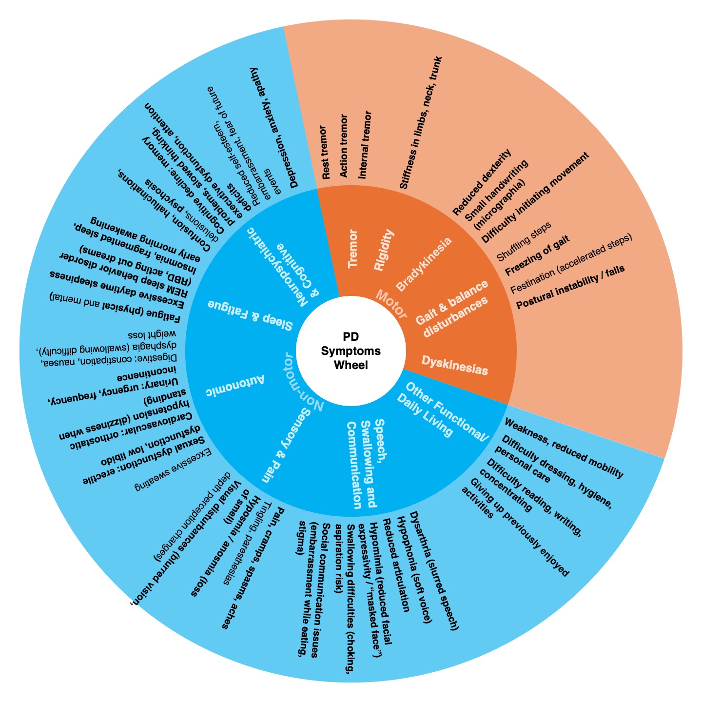
This was produced by Kobla Atsu Amewu (@ekaamewu). It uses colour to clearly distinguish between the motor and non-motor symptoms. It inverts the placement of domains and symptoms as compared to Concept 1, with the domains in the centre, which gives more space for the symptoms around the outside of the wheel.

Concept 3

This was produced by me (@vcatterson), and also uses colour to group symptoms based on the domain affected. It uses a bulls-eye concept to highlight how bothersome patients tend to find each symptom, with the most frequently problematic symptoms in the focal point, the centre. It aims to use a lay-person’s language for the symptoms, in consideration of the potential user being a patient.

The ask

Please vote for which you find most useful and appealing! And please comment below if there are particular features or aspects of each wheel that you like.

  • Concept 1: Radial bar chart
  • Concept 2: Simplified pie chart
  • Concept 3: Bulls-eye map
0 voters

We aim to synthesize all your feedback into a single version, which we will post again in the future for final comments. Thanks! :smiling_face:

7 Likes

Wow, all of these options are so cool. I think all of them are amazing and thank you to all for the work you put into them! I personally liked the first one and liked the way it groups the system/domain and makes the most sense to me practically.

While the first one was my favorite, I also like how the second chart color codes the motor and non motor symotms. Lastly, I really like how the third one draws your eye to the most bothersome symptoms in the center and the distinct use of colors for the symptoms lets me see what domain the symptom is in.

Overall, they are all really cool and can appreciate how much time and effort went into creating all of these. Curious to see what others think!

2 Likes

First of all, thank you and congratulations for creating these! I also can see that all of you put a ton on effort in all.

All of them have great elements!

I think overall layout of number 3 was the easiest for me to read, both because of the placement of text and for the use of light colors! Maybe I will include the color coding symbols (keeping number 3 colors) of number 1, and I really like that number 2 literally says “Parkinson’s Symptom Wheel”, so if it is not much trouble I’d love these three things combined!

Anyway I think all of them are nice and whichever option wins, it will be very useful!

Please give your vote, clinicians on this forum! @efernandez @psaffie

2 Likes

I like elements of all of them on some level. Here are my thoughts, for what it’s worth. :slight_smile:

Concept 1: color coding is nice, and there’s a lot of information here to look at. It is a bit difficult to match some of the symptom labels up, visually. And it looks like perhaps the outer ring isn’t needed, since there aren’t categories that go out that far. That might help with clarity.

Concept 2: I like the inversion/organization here, with categories in the middle and symptoms branching out from there. And the breakup between motor and non-motor. But it doesn’t have the “problematic symptom” information.

Concept 3: This one is easier to track/read for the “bothersome symptoms” , with the bullseye concept. Maybe a color key would be helpful with the categories.

I feel like it could be useful to have two, maybe. Concept 2 that breaks out symptom types, and another wheel with the metric of how bothersome patients tend to find each symptom. I’m picturing Concept 2 as something that can be a brochure and held in hand while the other two can be paper or digital.

Thinking some others might have useful input here: @Vidash @malosco @danieltds @gdp22 @jodiefm

2 Likes

Thanks a lot for the work that has gone into this.

I love Concept one because I believe the design has to be clear and legible.

I like Concept 2 because it’s drafted as a wheel but I don’t like to turn some to read and that’s basically my challenge with it considering there is a lot to read. If perhaps the symptoms were graded and put into two or 3 wheels and colour coded from bothersome to less common symptoms so there is less on the wheel, that might work for me.

Concept 3 is cool. Just prefer the top two better.

2 Likes

Thank you so much for your feedback, everyone! :smiling_face: :folded_hands:

We also felt that there were elements of each which were really positive, so wanted to get different perspectives before synthesizing the best elements into a single diagram. Your views and thoughts are really helpful data for the next stage!

We’re still open to further feedback from others, as it all helps to understand what works best. Please continue voting and leaving comments, ahead of us regrouping internally in about 10 days!

2 Likes